How a Buy Now Button Can Help You Sell More Online
Learn how a buy now button can help you sell more online by reducing checkout friction and giving customers a faster, simpler path to payment.
Table of Contents
- Introduction
- The high cost of a slow checkout
- The simple idea behind the button
- Why a shorter journey wins every time
- When the customer is ready to go
- Where should you place your buy now button?
- What makes a buy now button more effective?
- Building trust in a digital world
- Finding the right fit for your business
- When a traditional store still makes sense
- The final verdict on conversions
Selling online sounds like a straightforward goal until you actually start doing it. You’ve got a great product, you’ve set up a page, and you’re starting to see people click through from your social media. But then, something happens. Or rather, something doesn’t happen. The sales don’t come through as fast as the traffic does.
If your online sales are not where you want them to be, the problem might not be your product, your photography, or even your pricing. It might simply be the process.
Often, a customer is ready to buy, but the checkout feels too long, too complicated, or just too slow. In the world of online shopping, "friction" is the enemy of growth. Friction is anything that slows a customer down or makes them think twice. Every extra page, every unnecessary form field, and every "are you sure?" pop-up is a chance for a customer to change their mind or get distracted by a notification on their phone. This is where a buy now button can help by cutting out the noise and making it much easier for someone to pay you.
The high cost of a slow checkout
This isn't just a hunch; the data backs it up. Recent studies on e-commerce show that nearly 70% of online shopping carts are abandoned before the customer finishes the payment. That is a massive amount of potential revenue left on the table.
A huge portion of those people leave simply because the checkout process was too long, too confusing, or required them to create an account they didn't want. In a world where we are all short on time, making the journey difficult is the quickest way to lose a sale. When you shorten that journey, you aren't just being "efficient" - you are actively protecting your profit.

The simple idea behind the button
To understand why a buy now button works so well, it helps to look at how most online stores are built. Usually, they follow a traditional "trolley" model that was designed back when e-commerce first started. A customer finds a product, clicks "Add to Cart," goes to their "Basket," checks the items, clicks "Proceed to Checkout," and then finally enters their details.
For a big grocery store where someone is buying fifty different items at once, that makes perfect sense. You need a trolley for a big shop. But for a South African small business selling a specific service, a single handmade item, a digital product, or even a ticket to an event, that journey is often overkill. It feels heavy and unnecessary.
A buy now button is essentially a shortcut. It’s a clickable link or button that you can put on a website, a blog, or even in a WhatsApp message. It skips the "cart" phase entirely and takes the customer straight to a secure payment page. It gets them to the finish line faster by removing the middleman and letting them act on their decision immediately.
Why a shorter journey wins every time
In our local business landscape, we know that customers are often busy, multi-tasking, or dealing with patchy signal. We’ve all been there - trying to buy something while the load shedding schedule is ticking or while the kids are asking for dinner. If a checkout takes too long to load or requires ten different taps, we’ll likely put the phone down and move on to something else.
Buy now buttons increase conversions because they respect the customer's time and their data. By removing those unnecessary steps, you are making it easier for a person to stay focused on the purchase they wanted to make in the first place. You are capturing their interest while it is at its highest point, rather than testing their patience with a long-winded process.
When the customer is ready to go
It is important to remember that this approach works best when the customer already knows exactly what they want. If they’ve already read your description, seen your photos, and decided your product is the right fit, they don't need a guided tour of a massive online store - they just need a way to pay you. The buy now button is for the customer who has already said "yes" in their mind and is just looking for the exit.

Where should you place your buy now button?
Placement is everything when it comes to online sales. You want to put the button exactly where the customer makes the decision to buy. If they have to scroll up and down or hunt through a menu to find the "pay" button, you’ve already created friction.
The "Decision Point" Rule
The best spot for a buy now button is usually right next to the product price or immediately after a clear, punchy explanation of your service. If you have a long landing page with lots of details, it often helps to have one button near the top for people who are already convinced, and another one at the very bottom for those who needed to read all the way through first. The goal is to make sure the button is always within reach when the customer thinks, "Okay, I want this."
Link-in-Bio Profiles
If you use social media to drive traffic, your "link-in-bio" is prime real estate. Instead of sending followers to a generic homepage where they have to search for the product you just posted about, you can use a buy now button on a simple landing page. It keeps the momentum of the social media post alive and gives them a single, clear action to take.
Blogs and Articles
If you write helpful content or guides about your products, you don't have to wait until the customer finishes the article to show them how to buy. You can embed a buy now button right in the middle of a blog post. If they’re reading about how your specific product solves their problem, that is the perfect moment to offer them a direct path to the checkout.
What makes a buy now button more effective?
A button on its own is a great start, but how it looks and what it says can actually change how people feel about clicking it. To make your button truly effective, you want it to feel safe, clear, and easy to find.
- Use high-contrast colours: Your button shouldn't blend in with the background. If your page is mostly white and blue, maybe your button should be a bold orange or green. It needs to "pop" so the eye is naturally drawn to it.
- Be direct with your words: Avoid vague language. "Buy Now" or "Pay Now" is usually much more effective than "Submit" or "Continue." People like to know exactly what is going to happen when they click.
- Keep the surrounding area clean: Don't clutter the space around the button with too many other links, distracting images, or large blocks of text. Give the button some "breathing room" so it stands out as the most important thing on the page.
- Mobile-Friendly sizing: Since most of your customers are likely on their phones, make sure the button is big enough to be easily tapped with a thumb. Nothing is more frustrating than a tiny link that is hard to click on a small screen.

Building trust in a digital world
In South Africa, we are rightfully cautious about online shopping. We want to know that our money is going to the right place and that our details are safe. When you use a simple buy now button, you can actually build more trust by keeping things transparent.
1. Show the final price early
Nobody likes getting to the final payment screen only to see hidden "service fees" or unexpected shipping costs. Be upfront about the total cost right next to your button. When a customer feels like you aren't hiding anything, they are much more likely to complete the sale.
2. Use trusted local payment names
When a customer clicks your button and sees a payment screen from a brand they recognise - like a trusted local fintech - they feel a sense of relief. It shows that you are a professional business using professional tools.
3. Keep your branding consistent
Make sure the page where your button lives looks and feels like your business. Use your logo and your brand colours. If the payment page feels like a completely different world, the customer might get nervous and close the tab.
Finding the right fit for your business
Not every business needs a full, complex online store to be successful. In fact, many South African entrepreneurs find that starting with a simple, direct payment path is a much more practical way to grow. It allows you to start small, learn what your customers like, and build from there.
A buy now button is a great fit if you are:
- Selling a "hero" product: If you have one best-seller that everyone loves, don't make people hunt for it. Give them a direct button right on your main page.
- Taking deposits for a service: If you’re a consultant, a plumber, or a hair stylist, you can use a button to let people pay a deposit immediately after they’ve booked a time with you.
- Running a specific promotion: If you’re running a 24-hour special on social media, you can link that ad directly to a buy now button page. It’s much more effective than sending them to a generic homepage where they have to search for the deal.
- Selling tickets or digital goods: If you’ve written an e-book or are hosting a small workshop, a buy now button is the fastest way to get your customers through the door.
- Testing a new idea: If you have a brand-new product idea, you can set up a simple landing page with a button to see if people actually want to buy it before you spend months building a massive website.
When a traditional store still makes sense
While we love the simplicity of a single button, we have to be realistic: it isn't a magic fix for every single type of business. There are times when a traditional shopping cart is actually the better way to go.
For instance, if you have a massive catalogue with hundreds of small items - like a hardware store, a grocery business, or a large clothing boutique - customers usually want to add multiple things to a basket before checking out. In that case, a "trolley" makes sense because they are doing a big shop and want to pay for everything in one transaction.
It’s also worth sticking to a traditional setup if your product requires a lot of deep customisation, like choosing five different sizes, four different colours, and three different delivery dates for multiple items all at once. But for many niche businesses, service providers, or those with a few key products, the direct route is often the most successful one.
The final verdict on conversions
At the end of the day, do buy now buttons increase conversions?
The answer is a resounding yes, especially when they remove the "clutter" from the buying process. In our local business environment, where we deal with everything from data costs to busy daily schedules, simplicity is a massive competitive advantage. When you make the journey shorter, you make the decision easier for your customer.
Growing your business online does not have to mean building a massive, complicated system from day one. Often, it is about making it as easy as possible for your next customer to say "yes" to what you are offering. You don't need to overthink it; you just need to make it simple.
Online growth is a journey. It starts with making it easier for one person to pay, then the next, and then the next. By focusing on a smooth, simple experience, you are building a business that respects your customers' time - and that is always good for the bottom line. It’s about being practical, being helpful, and staying focused on what really matters: getting your great product into your customer's hands without any fuss.
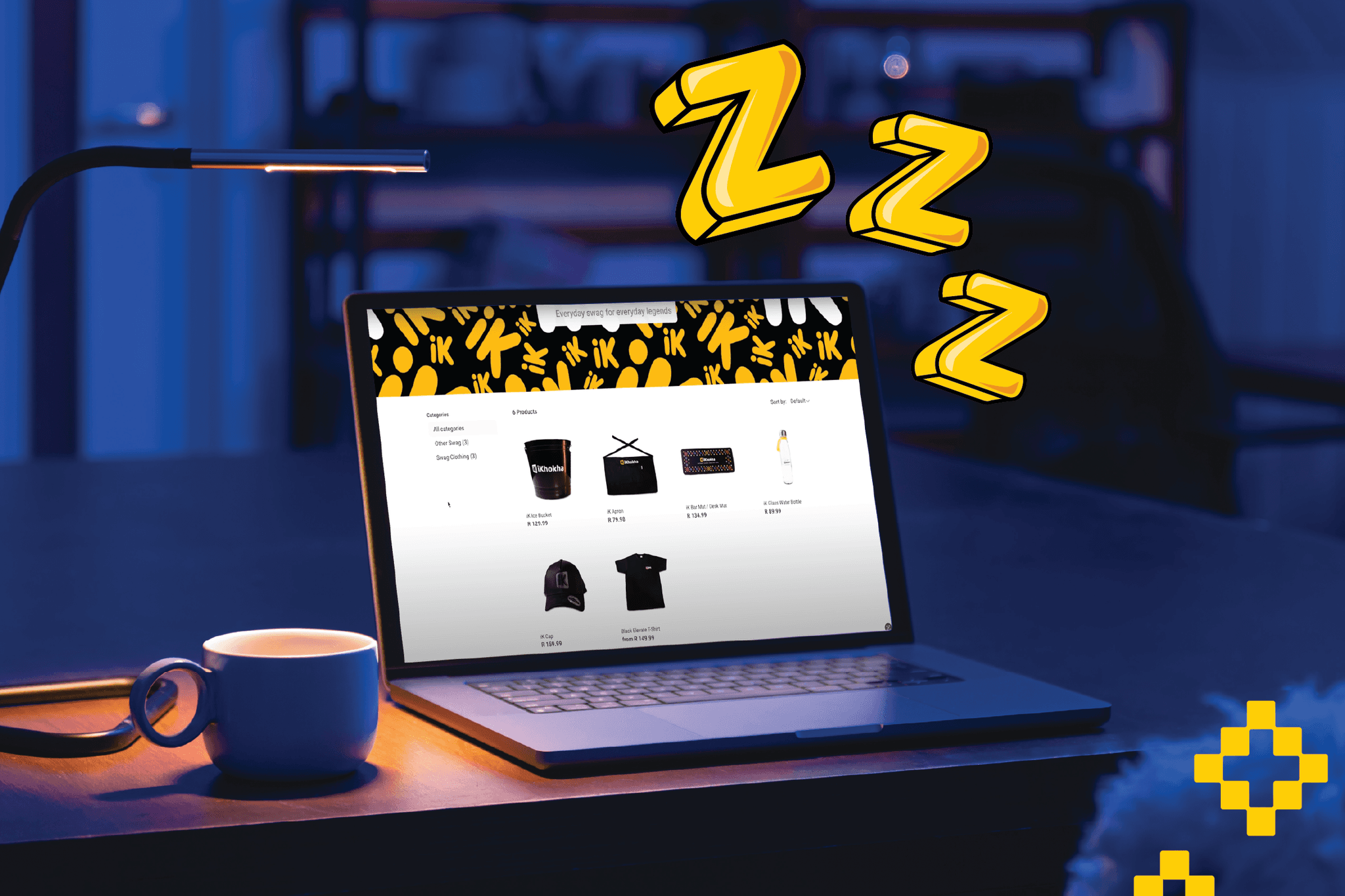
Ready to give it a go? If you are looking for a quicker way to sell online without overcomplicating things, the iK Buy Button is designed to help you create that direct path to payment for your customers. It’s a practical way to get paid faster so you can get back to the work you love.